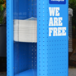
Newspaper racks for Metroxpress
The outdoor newspaper racks were designed and produced for our client Metroxpress – the biggest free daily newspaper published in Denmark. The project resulted in the development and integration of two newspaper rack types – one type for the Copenhagen subway system, and one for the commercial and residential areas around the city (outside the grocery stores, coffee shops, train stations, universities and similar).
The aim of the project was to design the racks that:
- would be approved to be placed in previously unavailable locations such as train and metro rail stations, as well as next to the grocery stores
- would increase exposure to the newspaper and attract more passers-by to pick up a copy, decreasing the time span for the pick up of all copies
- would be easy to maintain and durable, keeping initial color for a long time
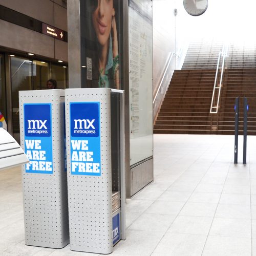
The product is a result of an extensive exploration of potential locations, functionality and usability, durability regardless of weather conditions, and analysis of materials, colors and shapes that reflect Metroxpress brand. The final newspaper racks were successfully integrated into the urban area, and serve thousands of Metroxpress readers on a daily basis.
Reflecting the brand
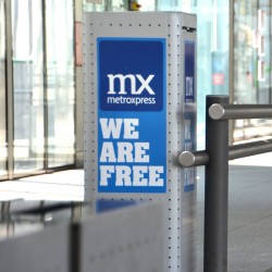
The design of the racks resonates with the brand’s target audience. The audience consists of urban and youthful readers, who are always on the move. It’s a vibrant audience with a firm grasp of urban culture. The racks come into play with their minimal yet vibrant, simple yet contemporary design that blends into urban surroundings.
The rack’s structure allows for a convenient placement of a logo including a tagline. The logo can be placed on different sides of the rack for increased visibility, and can be easily replaced without affecting the product.
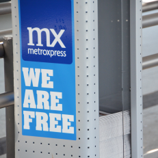
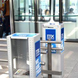
Rounded corners of the rack are in line with the rounded corners of Metroxpress logo. The focus is put inside the rectangles to highlight the brand and the tagline that communicate the purpose of the rack. Rounded corners make the product appear less harsh. As a result, the design creates perception of approachability, inviting passersby to grab a copy of a newspaper.
While the grey rack was designed for a subway, the blue was produced for the street areas around the city. The grey color allows the rack to blend into surroundings in accordance with the subway rules, without creating any noise. The blue, on the opposite, is meant to be highly noticeable on the street and follows the Metroxpress brand’s color guidelines.
